
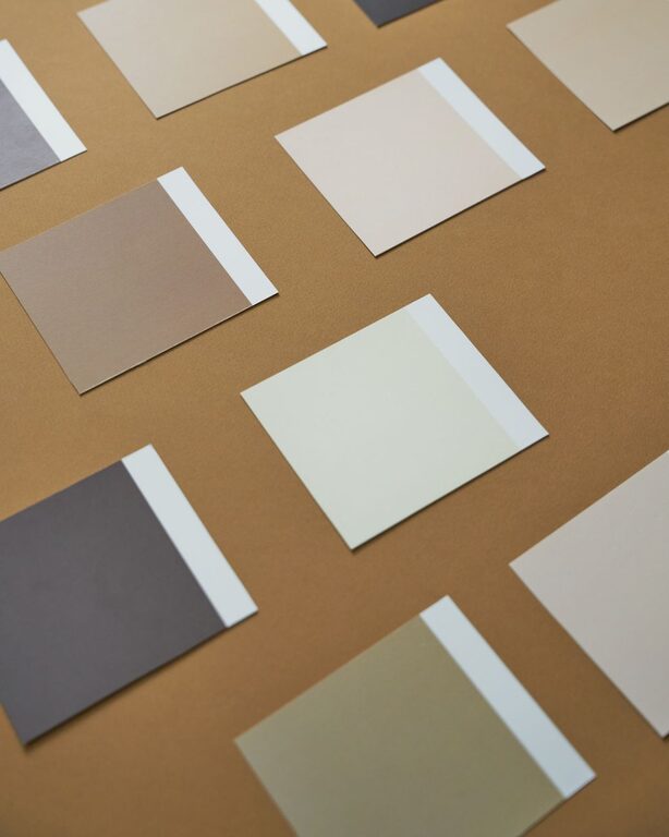
Tips for Choosing Calm Colors for Your Home
Creating a peaceful and calming atmosphere in your home often starts with choosing the right colors. Colors have a powerful impact on our mood and can influence how relaxed or energized we feel. If you want to transform your living space into a tranquil retreat, selecting calm colors is an excellent place to begin.
In this post, we will explore tips for choosing calm colors that suit your style and space. Whether you’re repainting a single room or your entire home, these guidelines will help you create a soothing environment that feels just right.
Why Choose Calm Colors?
Calm colors are typically soft, muted hues that promote relaxation and reduce stress. Unlike bright or intense colors, calm tones help slow the mind and create a sense of balance. These colors can enhance focus, improve sleep quality, and make your home feel welcoming.
Some examples of calm colors include:
– Soft blues
– Light greens
– Warm grays
– Gentle beiges
– Pale lavenders
Understanding the emotional effects of colors can guide you in selecting colors that meet your needs.
Tips for Choosing Calm Colors for Your Home
1. Consider the Purpose of the Room
Before picking a color, think about how you use the space. Different rooms benefit from different calming shades:
– Bedroom: Soft blues, lavender, or gentle greens help promote rest and relaxation.
– Living room: Warm neutrals like beige, taupe, or muted greens create a cozy, inviting atmosphere.
– Home office: Light blues or cool grays can enhance focus without feeling too sterile.
– Bathroom: Pale greens or soft aquas bring a refreshing, spa-like feel.
Choosing colors that complement the room’s function helps maximize the calming effect.
2. Test Colors in Different Lighting
Lighting plays a big role in how colors appear. Natural daylight, artificial light, and even the time of day can change a color’s look dramatically.
– Try painting sample patches on your walls and observe them at morning, afternoon, and evening.
– Use different types of light bulbs (warm, cool, daylight) to see how the color reacts.
– Consider the direction your windows face—north-facing rooms get cooler light, while south-facing rooms have warmer light.
Testing before committing ensures you pick a calm color that truly suits your space.
3. Use a Color Palette for Balance
Instead of sticking to just one color, create a balanced palette with complementary calm colors. This approach adds depth and interest without overwhelming the senses.
– Monochromatic palette: Use varying shades and tints of a single calm color.
– Analogous palette: Select colors that are next to each other on the color wheel, such as soft blue and green.
– Neutral palette: Combine calm grays, beiges, and whites for a sophisticated look.
Choose 2-3 main colors with a couple of accents to keep the palette cohesive and restful.
4. Avoid Colors That Trigger Anxiety
While calm colors are generally soft and muted, some colors can unintentionally cause agitation or stress, even if they are light.
– Be cautious with yellows and oranges; bright versions can be too stimulating.
– Avoid overly dark or intense colors like deep reds or blacks that might reduce the sense of openness.
– Too much gray can feel cold or gloomy if not balanced with warmer tones.
If you love a particular color that’s bold or bright, consider using it sparingly in accessories or accent walls.
5. Incorporate Natural Elements
Colors inspired by nature often feel calming because they connect us to the outdoors. Think about hues like:
– Sky blue
– Leaf green
– Sandy beige
– Earthy browns
– Soft stone gray
Pairing these colors with natural materials such as wood, stone, or plants enhances the tranquil vibe.
6. Consider Your Personal Preferences
Ultimately, your home should reflect your tastes and make you feel comfortable. Don’t feel pressured to follow trends or rules exactly.
– Select calm colors that you enjoy looking at every day.
– Bring in samples, fabrics, or artwork that feature your favorite shades.
– Trust your instincts if a color feels right or wrong in your space.
Personal connection to your color choices is key to long-term satisfaction.
7. Use Color Psychology as a Guide
Color psychology suggests certain colors naturally evoke specific feelings:
– Blue: Peaceful, trustworthy, calming
– Green: Refreshing, balanced, natural
– Lavender: Soothing, spiritual, gentle
– Beige/White: Clean, simple, peaceful
– Gray: Neutral, steady, balanced
While personal reactions vary, these general ideas can help you narrow down options when selecting calm colors.
Final Thoughts
Choosing calm colors for your home is a rewarding way to create a space where you can unwind and feel at ease. By considering the purpose of your rooms, testing colors in various lighting, and selecting a balanced palette, you’ll be well on your way to designing a calming environment.
Remember, calm colors don’t have to be boring. There are beautiful, subtle options that add character while keeping the mood peaceful. Take your time exploring samples and trust your preferences to design a home that feels like your personal sanctuary.
With these tips, you can confidently select calm colors and enjoy the benefits of a serene home. Happy decorating!
